Tuesday, August 21, 2012


watercolors in stillman and birn 'delta', 5 1/2" x 8 1/2"

i think this'll be my last post for a few weeks...  my sister's coming from virginia for three weeks, and while we don't have a definite plan (my go-with-the-flow is prevailing over her must-have-itinerary  ; ), we've got ideas about all kinds of places to go and things to see...   or maybe we'll just hang out here the whole time!  

thank you to those who've written asking if we're safe from the fires.  we're safe...   the closest fire is about 50 miles away,  it's just really smoky.  when the fires (everywhere, not just in california!) come to mind i visualize them calming right down...   it beats feeling helpless.     if you live in california and want a good site for keeping up with current wildfires, check out the cal fire (CDF) blog.  there's a lot of info there.

okay, see you in a few...  

* * *

“I am unable to distinguish between the feeling I have for life and my way of expressing it.” 

~ Henri Matisse

Thursday, August 16, 2012


'the acrobat's daughter' ~ oil paint on collaged canvas board, 4" x 6"

a few weeks ago i bought  'je suis le cahier: the sketchbooks of picasso'.   the thought of looking through picasso's sketchbooks was, well, tantalizing to say the least.  it is his drawings that i love best; when i saw the picasso exhibit last year in virginia i was mesmerized not by his paintings, but by his line drawings.  


between 1894 and 1967 he kept 175 sketchbooks.  this book doesn't begin to cover most of them, but there is a sampling from different periods in his life. some of my favorite pages are his preliminary sketches for the painting titled 'family of saltimbanques',  which takes me back to the painting at the top of the post!  i painted 'the acrobat's daughter' shortly after i got the book, with picasso's images of circus performers floating through my mind...

charcoal and graphite in stillman and birn 'gamma', 11" x 14"

an inaccurate drawing of one of his drawings!  the man could draw, i tell you!  the reason i'm showing it here is because i sprayed it 


with this fixative, and it really does seem to prevent the charcoal and graphite from rubbing off on the opposite page.  it's the most non-toxic fixative i've ever used; it has three ingredients - water, grain alcohol and casein.  it smells faintly of grain alcohol so you can spray it inside with no worries.   since it has water in it, you have to spray on several light coatings if you're spraying paper.

* * *

kiki smith, brooklyn museum

for fellow lovers of kiki, here's a link to an interview with her.  you have to download it (audio only), but it's worth it...

Thursday, August 9, 2012


watercolors on khadi paper, 6" x 6"

i've been doing a lot of what i think of as comfort painting.  i can feel something brewing inside (art-wise), and when that's happening i feel more or less stalled out creatively... so i just draw willy nilly stuff and paint - like a cat staring at the wall!  he's probably watching a spider, ha ha.

watercolors in my daily book, a  4" x 6" stillman and birn 'gamma'

i saw an insect like this is katherine dunn's 'creative illustration workshop' a few weeks ago and i've drawn a bunch of them since!  comfort for sure!

watercolors and albrecht durer watercolor pencils in my 'daily book'

very comforting!

watercolors,  watercolor pencils, & gouache in my 'daily book'

i think the woman on the left may be wondering why her hat is sitting so low on her head, or what that colored pencil's doing over there beside her - or maybe what the creatures on the other page have in mind! (not to mention that cup hanging over her head)   i painted her face with a  heavy layer of white gouache first to see how i liked it.  i didn't... it was too much white.  so yeah, i'll just blame her whole wonkyness on that.  ; )

it's smoky here from forest fires that are far away.  and hot! 

* * *

via tumblr

Friday, August 3, 2012


carmella's dream ~ oil paint and graphite on collaged cardboard

as i paint more  with water soluble oils i'm reminding myself to keep it simple, keep it fun...   when the urge to 'get better'/more polished creeps in i shoo it away.  because oils seemed so outrageously fun to me from the beginning, i wanna keep it that way...

 for a while now i've been wanting to do a post about shinhan watercolors and miscellaneous other watercolor stuff...  

 i found shinhan watercolors last winter when i was looking for a nontoxic naples yellow, and i've bought a lot of colors since then.   they flow beautifully and they're very inexpensive at dick blick.   i've read some reviews claiming that they're not lightfast - and then i've read others claiming that most of the colors are, so i don't know what the story is with that, but since i'm not concerned about my paintings lasting for hundreds of years it isn't an issue for me.  and besides, i'm mainly using them in my journals where they'll see very little light.


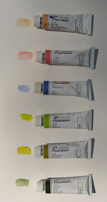
here are some of my favorite colors...   from the top: juane brilliant no. 2,  looks very much like salmon (the color).  i use it all the while on lips and cheeks.  next is shell pink - sigh...   i swear i could eat this color!  below that is lavender, which is a beautiful lavender-ish periwinkle blue.  then leaf green - almost a chartreuse, wonderful for leaves.  and greenish yellow - this is so beautiful!  an olive green but prettier.  and finally, davey's grey - a deep grey green.  these three greens have become my favorite greens...

i also use them like gouache and paint right out of the tube with them.    they work great like this.


this is sennelier's warm grey (# 705 on blick's color chart) which is the only other buff titanium (in watercolor) that i've found besides daniel smith's.  i might've gotten a bad tube of daniel smith's buff titanium because it's downright gooey, but  whatever the case, i was happy to find this user friendly version!


and my fav watercolor brush...  hands down, after trying quite a few,  the raphael kolinsky red sable, series 8404.  it holds a lot of paint, the tip is fabulous, and it's springy - not floppy.  i have no words for how perfect i think this brush is!


my zecchi paint set with other half and full pans added, and lots of gouache and shinhan watercolors squirted on the lid.  i've been loving painting with this set this summer.  my travel brush is a  #4 escoda, series 1214 brush, and i also stick in an inexpensive filbert for when i really wanna push the paint around.  i don't like the escoda brush nearly as much as the raphael, mainly because it's not springy. 

for fellow face painters, in case it's useful, the main colors above that i use for skin are: zecchi raw sienna (middle row, second from the right),  zecchi flesh tint (middle row, fifth from the left), sennelier warm grey (just left of flesh tint), and for darker shading,  zecchi raw umber (middle row, far right).  for cheeks and lips i use lots of the reds, oranges, and pinks - the shinhan juane brilliant no. 2 sees a lot of action, as does the shell pink!

and not shown here, white and ivory albrecht durer watercolor pencils...  if i want to paint a face white or ivory first i use them, because once they're dry  the color is permanent.  which means that they won't cause red on the cheeks to become pink.

* * *


“10 rules for students and teachers” from john cage (via tumblr)